Ali + Fred | Real Wedding Stationery
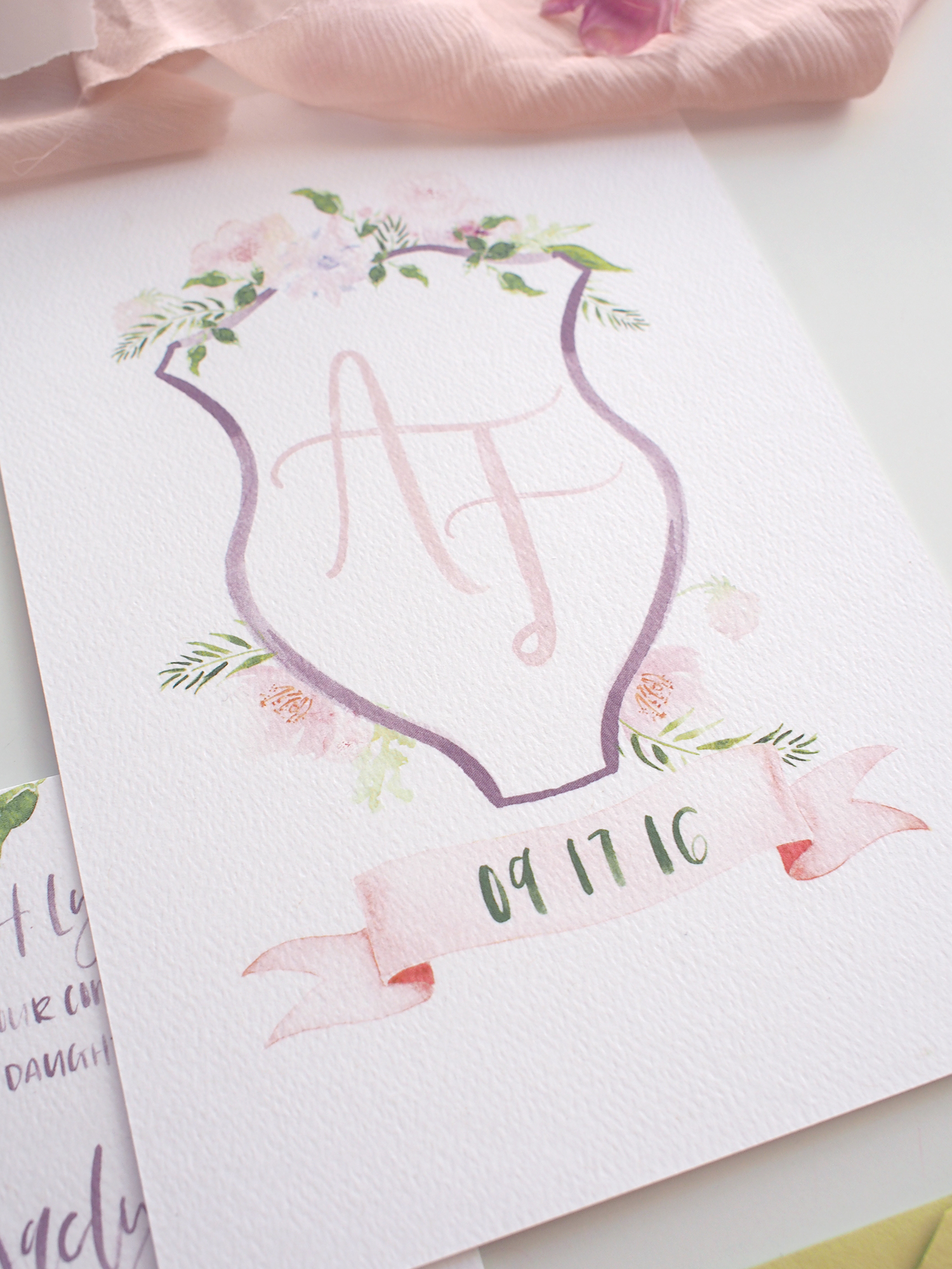
Alexandra came to AFF in search of an illustrative suite inspired by one of our most popular botanical border designs (here) we did last year, but in her own color palette. She shared inspiration of soft florals, greenery and attention grabbing crests in a palette of pinks and purples. I collaborated with Megan on illustrations as I knew she could create the soft yet detailed florals we needed to accent the calligraphy.
The suite was a mix of script and a hand lettered all caps font. I love when brides are open to changing up the lettering style rather than sticking with a full script. I like the contrast it gives while giving it a slightly more modern feel. We kept this theme throughout all of the pieces. We used Megan's illustrations on all pieces as well, but redesigned to fit each shape and design... a border for the invite, accents on the crest and a full pattern for the liner and back of the details card.
While the actual suite had shades of purple for the addressed envelopes, I decided to add a little edge for showcasing it here on the blog. Black and green envelopes really popped next to the soft florals. I love how much a slight change like this can change up the entire feel so easily! Something to keep in mind when choosing envelope colors for your own wedding invitations.
Now, onto the details...
Lettering, layout + design: A Fabulous Fete
Illustrations: Megan Heddinger, Eunoia Design Co.


