Taupe Letterpress Save the Dates for an Earthy Montana Wedding
Last month we had the pleasure of designing with C + P to create a simple yet impactful Save the Date that perfectly represented their upcoming wedding in the mountains of Montana. I'm always a sucker for a dose of contrast when it comes to design, so when we started chatting about the mix of earthy illustrations and luxe letterpress I knew it was going to be a stunning project.
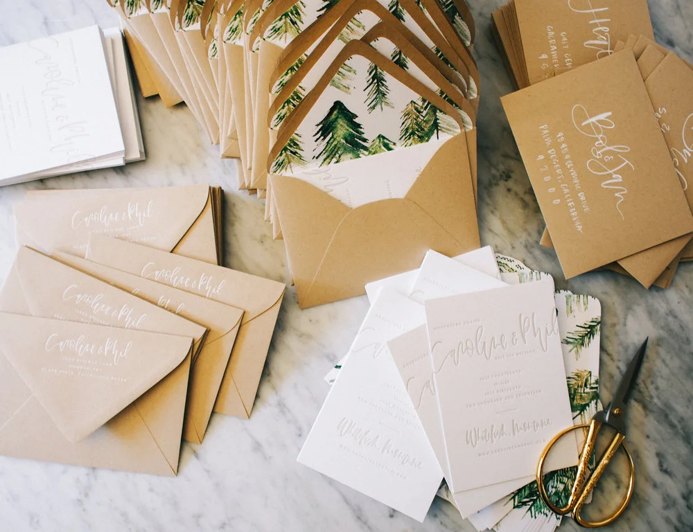
I shot a few photos as we were assembling and packing them up and wanted to share them here! Details are below on the individual pieces of this project.
So what was included in the package for these Save the Dates?
- Semi-custom Save the Date design where we mixed brush hand lettered elements with our signature sans-serif font. The bride knew she wanted to go with letterpress, so we decided on the bright white double thick cotton paper to really make the simple design shine. A taupe shade was chosen to tie back to the woodsy liner design.
- We illustrated custom liners with several fun watercolor trees.
- The envelopes were pressed with the return address we created (with a combo of hand lettered names + their address in the same font from the suite) in white foil.
- Each envelope was hand addressed in white brush lettering using one of our standard layouts emphasizing the names and block printing each address in all caps.


